
close
Choose Your Site
Global
Social Media

Views: 0 Author: Site Editor Publish Time: 2026-08-26 Origin: Site


Premium wine packaging relies heavily on tactile and visual cues. However, selecting the wrong foil process can quickly lead to compromised aesthetics or margin-draining production costs. At the decision stage, brands must rigorously align their design vision against substrate realities, run sizes, and physical durability requirements. You cannot simply apply any foil to any paper stock. A foil peeling off in an ice bucket destroys consumer trust immediately. This comprehensive guide breaks down the technical and commercial criteria for selecting the exact foil finish and application method for your specific wine tier. We will explore application mechanics in depth, evaluate stunning visual effects, and provide highly actionable procurement strategies. Ultimately, you will learn how to balance maximum shelf impact against realistic production constraints. Every material choice directly impacts your brand's market positioning.
Creative teams often envision a flawless label metallic finish covering intricate design elements. Reality soon introduces rigid production budgets, extended tooling lead times, and strict application limits. Brands face immense pressure to deliver luxury cues without destroying profit margins. A successful embellishment strategy bridges this gap. It must yield a label capable of surviving the bottling line, truck transit, and consumer use.
The ultimate hurdle remains the infamous "ice bucket test." Bottles often submerge in freezing water for hours. Poorly integrated foil will flake, bubble, or scuff off entirely under these harsh conditions. You must prioritize environmental survivability alongside visual appeal.
Strategic foil placement maximizes shelf appeal while actively controlling unit costs. Total foil coverage rarely equates to higher perceived value. Instead, targeting specific elements—like a brand crest, typography, or delicate border—draws the eye efficiently. Micro-embellishments communicate elegance. They also reduce raw material usage and decrease application errors.
Strategic Foil Placement and Value Correlation
| Coverage Level | Design Elements Targeted | Shelf Impact Perceived | Unit Cost Implication |
|---|---|---|---|
| Minimal (Under 10%) | Logos, crests, vintage years | Subtle elegance, high luxury | Low material cost, easier alignment |
| Moderate (10% - 30%) | Borders, large typography, key motifs | Strong visual anchor, traditional | Moderate cost, requires careful prepress |
| Heavy (Over 30%) | Background patterns, full illustrations | Highly disruptive, potentially flashy | High cost, significant rejection risk |
Best Practice: Always consult your printer during the initial design phase. Early conversations prevent expensive redesigns later.
Common Mistake: Approving artwork files before testing the chosen foil against the specific paper stock's absorbency rates.
Selecting the correct application method dictates both your visual outcome and your scalability. Two primary technologies dominate commercial packaging.
Hot stamping remains the gold standard for premium and ultra-premium tiers. The mechanism relies on three distinct elements: heat, intense pressure, and custom-engraved metal dies. Operators mount these brass or magnesium dies onto heavy presses. The press forces the wine label stamping foil directly into the paper fibers. Heat activates the sizing layer, bonding the metalized film permanently.
This method offers incredible strengths. It delivers superior opacity and razor-sharp edges. You can also combine hot stamping alongside embossing by using fluted dies. This creates a deeply tactile, multi-dimensional feel. Hot foil performs exceptionally well on porous, heavily uncoated estate papers.
The commercial reality presents some friction. Metal dies require high initial tooling costs. Setup times run slower than alternative methods. Therefore, hot stamping makes the most financial sense for mid-to-large runs or ultra-premium price tiers.
Cold foil operates on an entirely different mechanical principle. The process utilizes a flexographic plate to print a precise UV-curable adhesive onto the substrate. The web then passes a station where the foil film meets the adhesive. UV lamps cure the glue instantly through the film. Finally, the press strips away the excess carrier film, leaving the metallic areas behind.
Cold foil embellishment delivers distinct advantages for specific runs. It requires no expensive metal dies. The process runs inline at extremely high speeds. Furthermore, it easily accommodates overprinting. You can lay down silver foil and print CMYK inks directly on top, creating limitless metallic color gradients.
Implementation risks do exist. Cold foil struggles significantly on deeply textured or highly porous uncoated papers. The liquid adhesive simply sinks into the paper fibers before the UV light can cure it. This causes patchy, incomplete transfers. Consequently, cold application suits smooth, coated stocks or high-volume commercial runs best.
The aesthetic character of your foil directly communicates your brand narrative. Different finishes attract entirely different demographics.
Classic metallics serve as the absolute industry standard for heritage and reserve wine tiers. They instantly signal tradition, quality, and established authority. However, you must meticulously evaluate their reflectivity. A high-gloss mirror finish aggressively catches retail lighting. A satin or brushed finish provides a softer, more refined gleam. Silver pairs beautifully alongside crisp whites, while rich copper often elevates earthy reds.
Matte foil delivers a muted, highly contemporary look. It strips away the aggressive shine while retaining a luxurious metallic sheen. Designers frequently deploy matte finishes for modern, minimalist labels. Practically, matte options perform better during transit. They are far less prone to revealing micro-scratches caused by bottling lines or shipping vibration compared to their high-gloss counterparts.
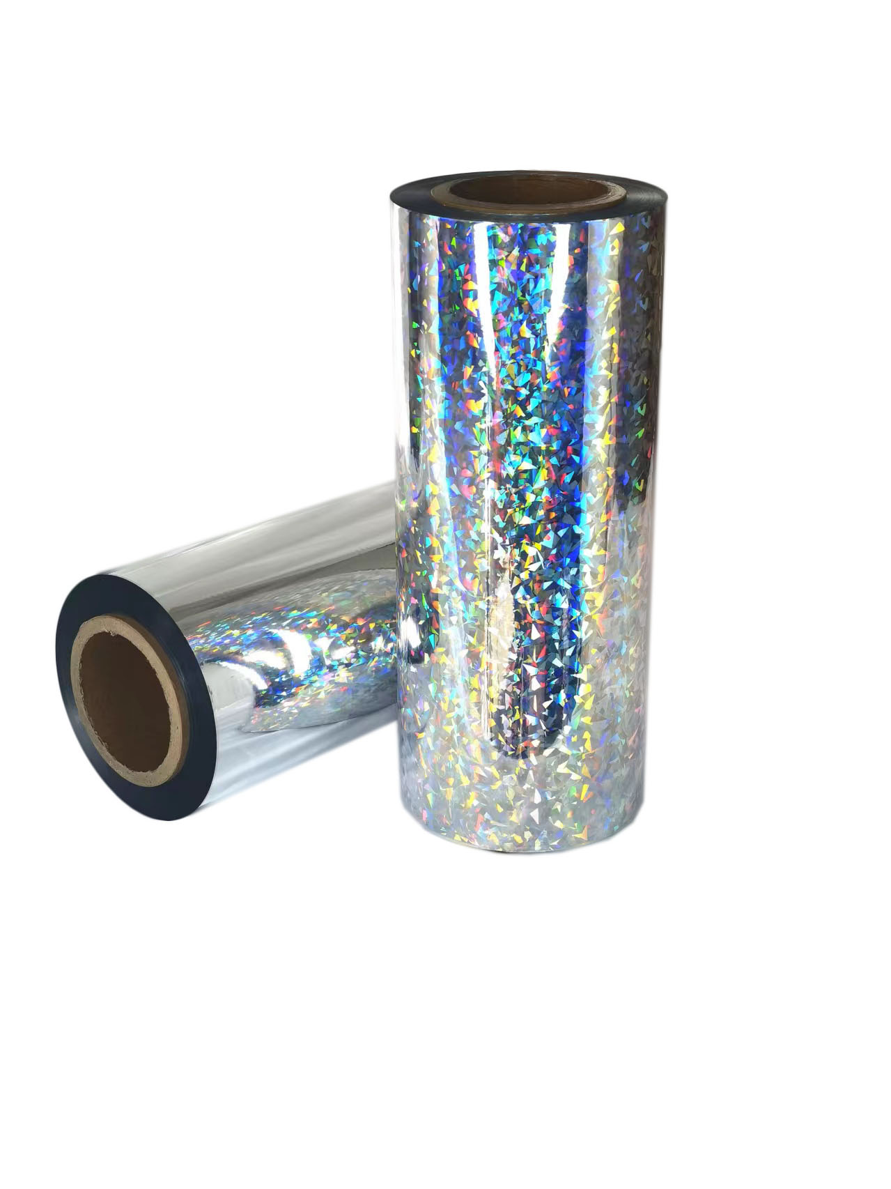
For brands seeking intense visual disruption, holographic label foil provides an unparalleled solution. The micro-embossed surface diffracts ambient light into striking rainbow spectrums.
Best Practice: Always view physical foil swatch books under actual retail lighting conditions. Studio lighting often misrepresents how a finish will perform on the store shelf.
A beautiful design file means nothing if it fails on the press. Understanding material physics prevents disastrous production runs.
Premium wineries love heavily textured cotton or thick estate papers. These substrates feel organic and expensive. However, their physical peaks and valleys create a nightmare for foil application. If pressure remains too low, "bridging" occurs. The foil spans across the texture valleys without making contact. It only adheres to the peaks, resulting in a broken, speckled appearance. High-pressure hot stamping mitigates this risk by forcing the material deep into every crevice.
You must ruthlessly evaluate your artwork for manufacturing tolerances. Combining heavy solid foil areas alongside micro-typography on the same die causes severe issues. To get the solid area to adhere, operators increase press pressure. This excess pressure forces the foil to bleed outward slightly. Small unfoiled gaps inside letters like 'A' or 'e' squeeze together. We call this "fill-in." It renders fine text entirely illegible. To fix this, separate heavy solids and fine details onto two distinct dies.
Labels face a brutal lifecycle after leaving the print facility.
Common Mistake: Neglecting to perform a 24-hour ice water test on the final production proof. Always verify adhesion physically.
Navigating the procurement process requires a structured, logical approach. Follow this framework to finalize your vendor and methodology.
Your run size dictates your financial parameters.
Digital flat proofs are inherently insufficient for embellishment decisions. A PDF cannot simulate light diffraction or tactile depth. Furthermore, it cannot confirm adhesive compatibility. You must request physical wet proofs. Alternatively, attend a live "press check" on the exact final substrate. Demand to see the foil applied at actual press speeds. This reveals bridging or fill-in issues immediately.
Ask your printer hard, technical questions before signing a contract. Clarify their capabilities upfront.
Matching the right foil finish requires aligning your aesthetic goals directly against your run volume and the physical limitations of your chosen paper stock. A breathtaking design concept fails entirely if it cannot survive the reality of high-speed printing or freezing moisture. You must bridge the gap between creative ambition and technical execution.
Moving forward, prioritize substrate compatibility above all else. Demand rigorous environmental testing. Ensure your final product survives the ice bucket test gracefully. Finalize your adhesive method and tooling choices only after reviewing physical wet proofs. By respecting these technical parameters, you guarantee a premium label that captures consumer attention and commands brand authority.
A: Yes, primarily with cold foil or specific print-receptive hot foils. This technique allows for stunning metallic color-matching and gradients, expanding your design possibilities significantly.
A: Usually, this indicates a failure of the primer or adhesive to grip the porous fibers of uncoated paper. It can also result from a lack of protective top-coating prior to ice bucket submersion.
A: Only for short runs or variable data applications, such as serialized bottles. The unit economics and slower speeds do not scale well for standard commercial production compared to traditional stamping methods.


