
close
Choose Your Site
Global
Social Media

Views: 0 Author: Site Editor Publish Time: 2026-09-03 Origin: Site


Approving a custom foil order involves incredibly high financial stakes. You must satisfy strict brand guidelines to protect your product's market image. Standard CMYK printing inks absorb light predictably. Metallic finishes reflect light dynamically. This fundamental physical difference complicates the quality control process significantly. Designers often expect physical foils to perfectly match digital screen renderings. These unrealistic expectations usually lead to endless proofing cycles. Such cycles waste precious time and drain your production budget quickly.
Conversely, overly loose tolerances cause major retail problems. They can quickly dilute your brand perception. Customers notice inconsistent packaging colors on store shelves. You need a reliable middle ground for color evaluation. This article provides a quantifiable framework based on industry-standard practices. We will help you evaluate foil color accuracy confidently. You should understand these rules completely before signing off on any large production run. You will learn exactly how to measure metallic variations accurately. We also outline the critical tools required for precise color evaluation.
Brands choose metallic finishes because they convey premium quality. You want your packaging to stand out immediately. However, these materials introduce unique physical measurement challenges. We must define a reliable custom foil color tolerance to ensure visual consistency across all orders.
Traditional inks look similar from most viewpoints. Metallic surfaces scatter incoming light constantly. Their visual appearance changes entirely based on your viewing angle. A foil might look perfectly matched head-on. It could appear drastically darker when tilted backward. This scattering effect confuses standard measurement devices. It also creates friction between design agencies and commercial printers.
Base materials heavily alter your perceived foil color. Uncoated kraft paper absorbs foil adhesives aggressively. Gloss coated board sits perfectly flat. Surface tension shifts dramatically across these different materials. Porosity also varies across standard paper stocks. These substrate traits change the final metallic sheen. The foil film itself represents only one part of the equation. The paper beneath it acts as a crucial variable. You must account for this complex material interaction.
Never trust a computer monitor for metallic finishes. RGB screens emit digital light directly into your eyes. CMYK printouts try to simulate metallic shine poorly. They physically cannot replicate a true metallic luster. You must demand physical validation every single time. It remains a non-negotiable step for quality control. Relying on PDF proofs causes expensive manufacturing errors.
Subjective visual checks fail consistently during quality control. You need mathematical precision for accurate manufacturing. We rely on the foil color delta E metric. This standardizes color matching across the entire global print industry.
Delta E represents the mathematical distance between two colors. A lower number means a closer visual match. It removes human bias from the color evaluation process. The metric uses the CIE L*a*b* color space model. This model maps color across lightness, red/green, and blue/yellow axes. It tells you exactly how far off a production batch is from the original proof.
You must set realistic expectations for your print partners. Foil behaves differently than flat ink. Perfect zero-variance matches simply do not exist in thermal stamping.
Acceptable Delta E Variance for Metallic Foil Stamping
| Delta E (Δ E) Value | Visual Perception | Commercial Application Standard |
|---|---|---|
| < 1.0 | Imperceptible to the human eye | Rarely guaranteed in standard commercial foil stamping. |
| 1.0 – 2.5 | Highly acceptable match | The standard for luxury and premium retail packaging. |
| 2.5 – 4.0 | Slight differences visible closely | Commercially acceptable for general packaging applications. |
Standard commercial print measurement tools often fail here. They measure flat colors exceptionally well. Reflective surfaces require highly specialized equipment. You must use specific spectrophotometer geometries. A d/8 sphere spectrophotometer captures scattered light effectively. It provides accurate readings for highly reflective metallic films. Traditional 45/0 spectrophotometers misread metallic glare constantly. They often report wildly inaccurate Delta E values. You must confirm your vendor uses the correct measurement hardware.
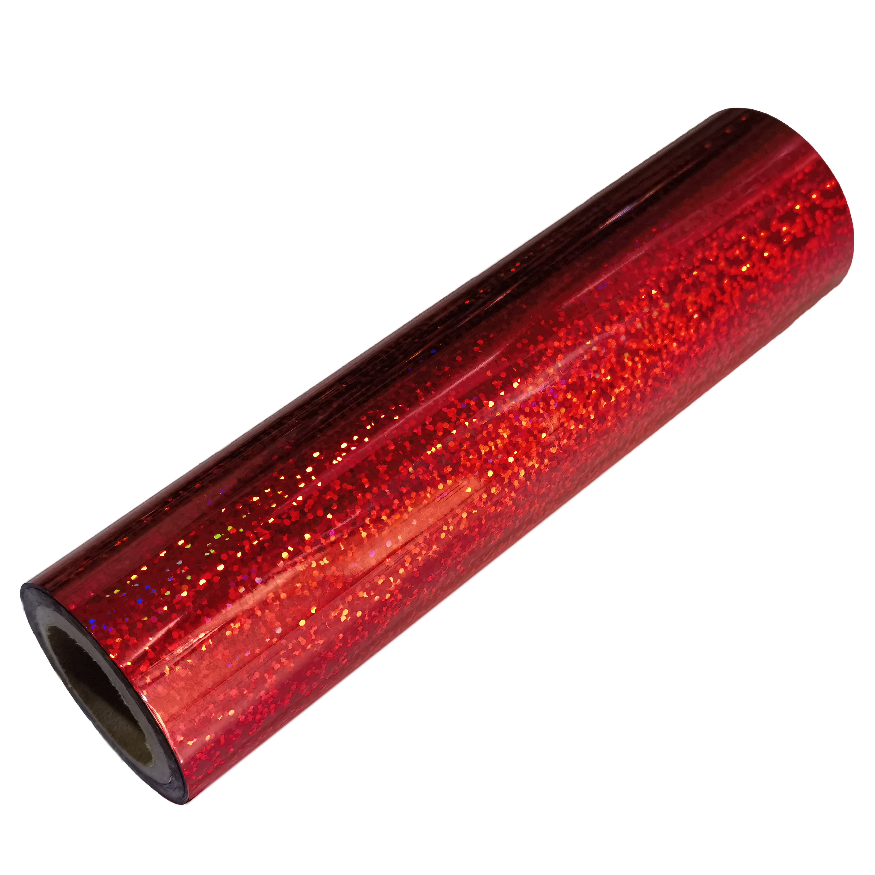
Visual evaluation requires strict operational protocols. You cannot simply hold up a proof near an office window. A proper custom foil sample needs rigorous scientific review. This diligent process ensures true metallic shade consistency across your entire order.
Ambient natural light changes constantly throughout the day. Office fluorescent bulbs skew colors heavily toward green. You must review proofs under standard D50 lighting booths. D50 represents a 5000K color temperature. It effectively eliminates the risk of metamerism. Metamerism happens when colors match perfectly under one light source but clash under another. This phenomenon routinely ruins retail packaging displays. Standardizing your lighting prevents costly surprises.
You should establish a standard operating procedure internally. Your SOP must define specific viewing angles for all reviewers. Tilt the sample carefully during evaluation. Observe the metallic shift at 45 degrees. Observe it again at 90 degrees. This provides consistent visual feedback across all product reviews. Everyone on your quality assurance team must use these exact same angles.
Manual drawdowns apply foil differently than heavy industrial machinery. Technicians perform manual drawdowns by hand. They cannot replicate true mechanical production pressure. Thermal impacts also vary significantly during manual application. A machine-run proof remains the only valid testing method. It gauges the final thermal and pressure impact accurately. Machine proofs cost slightly more upfront. They save thousands of dollars in rejected mass production runs later.
Large packaging orders often span multiple production runs over several months. You need a highly structured batch color approval process. This structured approach prevents messy vendor disputes later.
You must select a single physical proof to serve as your benchmark. Mark it clearly as officially approved. Store it safely in a dark environment. Ensure the storage room remains climate-controlled. This prevents paper yellowing over time. This physical sheet becomes your master standard. It acts as the definitive anchor for all future production runs. You will judge every new batch against this specific physical sheet.
Absolute perfection is impossible in physical manufacturing. You should create acceptable boundary limits proactively. Work alongside your print partner to establish these bounds. Generate "light" and "dark" limit samples. Create "warm" and "cool" limit variations. These physical bounds clearly define what constitutes a rejected batch. They remove subjective emotional arguments from the quality control process.
Minor manufacturing shifts happen naturally during long runs. Press temperatures fluctuate throughout the working day. Ambient humidity affects raw paper moisture levels. Stamping dies wear down gradually over thousands of impressions. These variables naturally introduce slight batch-to-batch deviations. Absolute zero-variance remains a completely flawed expectation. You must build acceptable physical variance clauses into your vendor contracts.
Your commercial printing partner makes or breaks the entire project. You must vet them rigorously before signing contracts. Ensure they understand strict metric-driven color standards. Do not accept vague verbal promises regarding quality.
Ask these specific questions during your initial vendor selection phase. Their answers will quickly reveal their true technical competence.
Watch out for overly optimistic and unrealistic promises. Beware of vendors guaranteeing a "100% exact match" to your digital screen. This remains scientifically impossible due to light physics. Refusing to provide physical tolerance limit samples acts as another major red flag. Avoid partners who deflect questions about their measurement geometry or lighting setups.
Enterprise brands require highly scalable color solutions. Regulated industries demand strict batch consistency. Look for vendors utilizing automated closed-loop color management systems. These advanced systems monitor color shifts in real time. They adjust press settings automatically during the run. They effectively minimize human error during massive packaging print runs.
Successful custom foil procurement requires a delicate balance. You must enforce strict metric-driven standards rigorously. Delta E provides this necessary objective measurement. However, you must also understand physical manufacturing limitations clearly. Zero variance simply does not exist in commercial foil stamping.
Next Steps:
A: No. Screens emit light (RGB) and cannot simulate the physical reflectivity and texture of metallic foil.
A: Generally, a Δ E of up to 3.0 is considered a standard commercial match, while luxury packaging may demand ≤ 2.0.
A: Yes. Uncoated, textured papers scatter light differently than smooth, coated stocks, subtly changing the perceived metallic shade.
A: Rely on a physical "master standard" stored in a dark, climate-controlled environment, and evaluate all new batches against this specific baseline using a spectrophotometer.


