
close
Choose Your Site
Global
Social Media

Views: 0 Author: Site Editor Publish Time: 2026-08-18 Origin: Site


Specifying pearl foil is significantly more complex than standard metallic gold or silver. Unlike highly opaque metallics, these specialty materials demand precise chemistry and mechanical control. If done incorrectly, the finish can appear plastic, muddy, or fail to adhere properly to premium substrates. Brands risk severe production delays and compromised aesthetics without a meticulous specification process. Material choices dictate everything from adhesion strength to perceived consumer value. This guide provides a technical and commercial framework for evaluating, shortlisting, and specifying pearl foils. You will learn how to achieve a high-end, subtle luxury aesthetic without production delays or quality compromises. We explore substrate interactions, visual property tuning, and manufacturing risk mitigation directly. The variables involve heat ranges, die materials, and surface tensions. Proper understanding eliminates costly trial-and-error sessions on the press. Armed with these specific insights, you can navigate the press room confidently. Your final packaging will reflect your exact design intent perfectly.
Modern luxury packaging trends heavily favor understated elegance. We see a massive aesthetic shift occurring in retail environments today. Brands actively move away from the high-contrast flash of traditional metallics. Instead, they specify pearl hot stamping foil for its subdued, iridescent finish. This subtle luster aligns perfectly alongside modern consumer preferences. It suits high-end cosmetics, bridal collections, and fine jewelry packaging beautifully. It communicates quiet luxury rather than loud opulence. The modern consumer equates subtle details with authentic brand quality. They reject overly glossy finishes as cheap or mass-produced.
Cost analysis often drives packaging decisions for major product launches. You must analyze the return on investment carefully. Material costs for specialized formulations run marginally higher than standard silvers. Tooling and setup times might also add slight manufacturing premiums. However, the perceived premium value justifies this upfront investment easily. Flagship product lines command higher retail prices when utilizing premium touches. Consumers subconsciously link tactile packaging quality to superior product efficacy. A minor increase in packaging cost yields massive brand equity gains. It builds immediate trust when the consumer handles the box.
Versatility makes these finishes highly attractive for packaging designers. You can adapt them across various packaging formats easily. They elevate standard structural designs without requiring complete structural overhauls. A simple rigid setup box gains immediate sophistication. Similarly, folding cartons transform into premium retail touchpoints instantly. Elevated gift box decoration thrives on these versatile applications. They bridge the gap between simple paperboard and high-end presentation seamlessly. You can apply these finishes to drawer boxes, magnetic closure boxes, and slipcases. The visual consistency across a diverse product portfolio strengthens brand recognition.
Paper choice heavily dictates your final visual result. You must understand translucency to specify these materials accurately. A semi-transparent foil interacts dynamically across different paper colors. A white pearl applied to a dark navy stock changes drastically. The dark background absorbs light underneath the pigment layer. It makes the finish look muted, greyish, or muddy. In contrast, the same material on cream stock looks brilliant. It reflects light beautifully back to the viewer. You cannot treat translucent formulations like highly opaque golds. They behave more like watercolor paints than solid acrylics. Background colors dictate the final perceived hue and brightness level.
Surface treatments also matter immensely during the stamping process. Coated and uncoated stocks demand completely different release formulations. Uncoated papers offer high tactile luxury and organic textures. They absorb moisture and require specific surface tensions to bond properly. They require easier release characteristics to penetrate deep paper fibers. This prevents edge flaking and ensures crisp typography. Coated or laminated papers present entirely different manufacturing hurdles. You need specialized adhesives inside the transfer structure. These anchor the pigment properly to BOPP films or soft-touch laminations. Soft-touch laminations possess very low surface energy. Standard foils wipe right off these challenging matte surfaces.
| Substrate Type | Adhesion Challenge | Recommended Formulation |
|---|---|---|
| Uncoated Textured Paper | Ink spread and edge flaking | Easy-release formulations |
| Soft-Touch Lamination | Low surface energy anchoring | High-tack adhesive sizing |
| Gloss Coated Board | Blistering under high heat | Low-temperature transfer types |
| Recycled Kraft Board | Uneven surface fiber lift | Heavy coat weight formulations |
Pairing materials requires extreme care and aesthetic balance. Stamping directly onto pearlized paper foil creates a highly nuanced effect. You want to avoid visual clashing at all costs. Two competing iridescent surfaces can create visual chaos quickly. Aim for a sophisticated tone-on-tone result instead. Balance a highly lustrous base paper against a matte satin stamp. Contrast in finish depth creates visual intrigue without appearing gaudy. The light catches the stamped logo differently than the surrounding paper. It rewards consumers who examine the packaging closely under various angles.
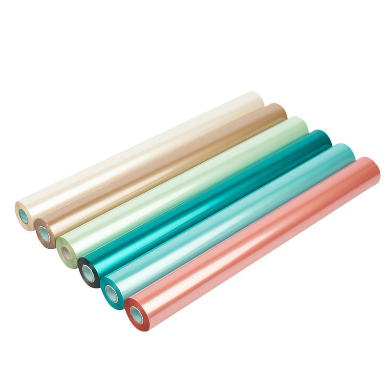
Opacity grading serves as your foundational visual metric. You must define the spectrum accurately before ordering production runs. Options range from highly sheer to high-opacity solid coverages. A sheer iridescent wash adds subtle shimmer over printed artwork. It allows underlying CMYK printing to show through clearly. A solid opacity provides dense color coverage across blank substrates. It blocks the underlying paper color almost entirely. You specify the exact grade based on your base paper color. Dark packaging demands high-opacity formulations to prevent color shift. Light packaging can utilize sheer grades successfully for elegant washes.
Selecting a custom pearl color requires strict brand matching protocols. You outline the matching process using physical Pantone references. Supply your vendor with exact target drawdowns or physical swatches. However, you must note the distinct manufacturing limitations involved. Custom tinting involves higher minimum order quantities from suppliers. Minimums often reach dozens of master rolls. A specific pink pearl or blue pearl requires extended lead times. The factory must blend raw pigments to match your unique specification. Plan your production schedule accordingly to avoid missed launch dates. Do not assume custom shades ship immediately from local warehouses.
Luster and finish variations dictate ultimate retail shelf impact. You must differentiate between satin, matte, and high-gloss finishes. Satin offers a soft, diffused glow under most lights. It feels incredibly modern and elegant. Matte provides a completely flat iridescence popular in cosmetics packaging. High-gloss catches intense highlights and demands perfect substrate smoothness. It mimics the look of wet automotive paint or polished pearls. Each finish interacts uniquely across varying retail lighting environments. Warm boutique lighting flatters satin finishes beautifully. Harsh fluorescent store lighting often requires high-gloss options to stand out. You must test these finishes in your exact retail setting.
Thermal sensitivity remains a primary concern on the press floor. You must detail the specific heat ranges required for success. These specialty formulations often demand different stamping temperatures than standard metallics. Sometimes they run colder to prevent pigment degradation or color shifting. Other times they require more heat to activate specific adhesives properly. Operators must calibrate the press temperature meticulously. Failure to adjust press temperatures causes "filling in" of fine details. Overheating causes the adhesive to spread beyond the die area. It also leads to poor adhesion across heavily inked areas. Running too cold leaves patches of un-transferred material.
Die selection directly impacts your final image crispness. We strongly recommend CNC-engraved brass dies for long luxury runs. Brass offers vastly superior heat retention compared to magnesium plates. It provides incredibly clean edges on slightly thicker material layers. Magnesium dies degrade quickly under high pressure during large runs. They lose their sharp edges after a few thousand impressions. Copper dies offer good heat transfer but lack durability for massive runs. Brass justifies its higher upfront tooling cost through pristine consistency. It eliminates the need to replace dies mid-production. It ensures the ten thousandth box looks identical to the first.
Adhesion testing requires strict standardized quality control protocols. You must establish these parameters before mass production begins. Random sampling provides false confidence. We mandate the standard 3M tape test on early production pulls. Operators must record test results systematically.
Registration challenges emerge when combining flat stamping and embossing. We highlight the severe risks associated using two separate press passes. The material stretches differently over newly embossed ridges. This stretching causes microscopic cracking across the delicate iridescent surface layer. Two-pass registration also introduces inevitable human and mechanical alignment errors. We recommend single-pass foil-embossing dies exclusively for these demanding applications. These fluted dies stamp and emboss simultaneously in one vertical motion. They lock the foil directly into the embossed contour flawlessly. However, employ them only if your supplier possesses proven expertise. Fluted tooling requires exceptional makeready skills.
Anatomy of a professional specification sheet requires absolute precision. You must hand your packaging manufacturer documents containing zero ambiguity. Vague instructions guarantee expensive press delays and rejected production lots. Specifying "pearl foil" without details invites disaster. Your specification sheet acts as your ultimate quality control contract. It protects your brand identity and your manufacturing budget simultaneously. It removes subjective interpretations from the production line entirely.
| Specification Category | Required Detail | Example Entry |
|---|---|---|
| Brand / Series Reference | Exact manufacturer product code | Kurz Luxor Pearl 700 Series |
| Opacity Requirement | Sheer, Semi-transparent, or Solid | High-Opacity Solid White |
| Substrate Details | Weight, texture, and surface finish | 350gsm SBS, Matte Soft-Touch Lamination |
| Line Thickness Minimum | Minimum positive and negative stroke | 0.25mm positive / 0.3mm negative |
| Tooling Requirement | Die material and engraving method | CNC-engraved 7mm Brass Die |
| Testing Standards | Specific QC procedures required | Pass 3M 610 Tape Test, 50 Rubs without offset |
Artwork line thickness minimums require careful upfront design consideration. We recommend a minimum stroke width of 0.2mm consistently. This prevents bridging across tight letterforms or intricate serif typography. Thicker material layers simply cannot hold microscopic details like standard foils. If designers ignore these limits, the factory must increase heat. Increased heat causes the material to bleed and lose definition.
The proofing protocol demands equal rigor before tooling commitments occur. Require a "drawdown" or flat-stamp proof on actual production paper. A drawdown involves applying the material using a heated hand roller. Never approve production based on digital renderings or standard paper tests. Digital screens cannot replicate translucent light physics accurately. Generic paper tests fail to reveal specific adhesive incompatibilities. Seeing the exact material on the exact substrate is non-negotiable. Only then should you release funds for expensive brass tooling.
Successful specification bridges the gap between creative vision and manufacturing reality. You must balance aesthetic desires against physical substrate limitations carefully. Proper material selection elevates your packaging from ordinary to exceptional. Trusting a vendor requires seeing localized testing data firsthand. They must prove material adhesion on your chosen production substrates. Never accept verbal assurances regarding complex specialty coatings. Do not rely entirely on generic supplier swatch books either. They show the material under ideal, heavily controlled conditions. We highly recommend consulting directly alongside a packaging engineer early. Request a curated sample book to observe these complex interactions directly. Proper planning ensures your luxury packaging launches flawlessly. Your customers will feel the premium quality immediately upon unboxing.
A: Yes, but it requires a high-opacity formulation. Standard semi-transparent pearl will take on the dark hue of the background paper, appearing dull rather than luminous. You must specify solid-coverage formulations to maintain bright iridescence against dark or deeply saturated base colors. Test samples thoroughly before proceeding.
A: Yes. However, due to the foil's structure, it is often safer to use a combination stamping-and-embossing die to prevent the foil from cracking during a two-step process. Fluted dies apply heat, pressure, and dimension in one seamless pass. This eliminates registration errors and preserves the delicate iridescent finish perfectly.
A: Hot stamping foil transfers an ultra-thin layer of pigment/metal, leaving the PET carrier film behind. The stamped box is generally widely recyclable, though specific certifications (like repulpability) depend on the exact foil and adhesive used. The metallic or pigment layer is microscopic and does not hinder standard paper recycling facilities.
A: Because pearl foils can be slightly thicker and require specific release temperatures, it is generally recommended to keep line weights above 0.2mm to 0.25mm to avoid filling in fine serif typography. Negative space should be even wider, around 0.3mm, to prevent bridging when the adhesive melts and spreads slightly.


