
close
Choose Your Site
Global
Social Media

Views: 0 Author: Site Editor Publish Time: 2025-08-20 Origin: Site


Ever run your fingers over a sunken logo and wondered, “What is debossing?” It’s an impression pressed into a surface—no ink needed—leaving a durable, tactile mark. Many confuse it with printing. In this post, you’ll learn what debossing is, how it differs, and common myths.
Debossing pushes design into the surface, a sunken impression. Embossing raises design above the surface. Laser engraving removes material using a laser beam; no pressing.
Quick comparison
| Method | Surface result | Material removal | Tooling | Heat or pressure | Cost note |
|---|---|---|---|---|---|
| Debossing | Sunken design | No | Single die | Heat plus pressure common | Lower than many premium finishes; single die |
| Embossing | Raised design | No | Male and female dies | Heat plus pressure | Two dies increase setup |
| Laser engraving | Etched cavity | Yes | No dies | Laser energy | Varies by area and depth |
When do we choose each one?
Debossing for feel
We need quiet luxury, deep touch, long wear. It suits labels, cartons, journals. Pair it to add shine using Huasheng hot stamping foil.
Embossing for visibility
We want bold relief, strong light play, obvious edges. Two-die setup delivers height and drama.
Laser engraving for precision
We need crisp micro detail, direct material removal, durable marks on hard parts. It differs from pressing; no die, no squeeze.
Debossing uses a die and pressure. The press drives the die into the sheet. Some machines heat the die using built-in elements. Others need a preheated die.
Step by step
Artwork
We clean vectors. Simple shapes hold detail.
Die
We engrave the plate. Single die in many jobs.
Make-ready
We pack the bed. Balance pressure across the sheet.
Test pulls
We run a few sheets. Check depth, edges, alignment. Pre-production tests prevent damage.
Production
We lock settings. Run speed to match dwell and coverage.
QC
We measure depth and watch edges. Fix small drift fast.
Why control matters
Pressure
Too low gives soft detail. Too high harms stock. Calibrate often.
Dwell time
Longer dwell deepens the mark. Shorter dwell keeps speed high.
Registration
Guides and marks keep position true. Digital register helps on complex art.
Key controls and how we dial them
| Control | What it does | How we set it |
|---|---|---|
| Heat | Softens fibers or polymer | Use heated die or preheat the die before runs. |
| Pressure | Drives depth | Calibrate, test on actual stock. |
| Dwell | Shapes edge crispness | Match to area size and paper weight |
| Registration | Keeps art in place | Fixed guides, marks, sensor help. |
Where finishing fits
We add shine after the deboss pass on short runs. One route uses Huasheng digital foil or toner reactive foil for accents on names or seals. It pairs well for quick custom work. Also common to combine debossing and foil in separate passes.

We use a few core styles. Each one changes depth, shine, and cost.
No ink. No foil. Deep, subtle impressions. It suits paper, fabric, leather, cardboard, some plastics. Great for minimalist packs and journals.
Print first. Align the die to the print. Press for texture on logos or display text. It works for packaging and premium marks.
Run both to build contrast and layered texture. It fits paper, cardboard, fabric, select plastics. Use it for elegant stationery and high-end packs.
Lay foil first. Press the die to indent the foil area. Result: metallic sparkle and a sunken feel. Many teams choose hot foil; some lines run cold foil. We often pair the pass to Huasheng cold stamping foil on inline jobs.
Vary depths across the art. More dimension, richer shadows. Brass tooling often required for complex relief.
Quick chooser
| Goal | Pick | Why it helps |
|---|---|---|
| Quiet, premium feel | Blind deboss | Deep, subtle touch on uncoated stocks |
| Logo pop plus color | Registered deboss | Print alignment adds crisp edges and texture |
| Layered texture | Emboss + deboss | Dual relief creates contrast on packs |
| Shine and depth | Foil + deboss | Metallic finish plus indentation for luxury sets |
| Maximum dimension | Multi-level | Varied depths shape highlights and shadows |
What to weigh before you run
Aesthetic
Minimal look favors blind. Bold logos favor registered or foil + deboss.
Material
Paper and leather take depth well. Plastics need careful heat and pressure.
Budget
Simple art keeps cost lean. Multi-level adds tooling time and spend.
Different materials react in unique ways. We tune pressure, heat, and dwell for each stock.
Quick guide
| Material | Stock tip | Heat note | Risk |
|---|---|---|---|
| Paper, Cardstock | Aim 300 gsm or more; texture boosts detail | Light to moderate heat | Crush, fuzzy edges |
| Leather, Leatherette | Match pressure to grain | Gentle preheat helps flow | Grain distortion |
| Fabrics | Dense weaves work best; add backing if needed | Low heat | Stretch, ghosting |
| Plastics, Vinyl | Tight temperature window | Precise heat needed | Warping, gloss change |
| Rubber, Metals, Composites | Harder surfaces handle crisp marks | Often no heat or localized heat | Spring-back, marring |
Thicker sheets take shape cleanly. 300 gsm or more gives stable depth. Texture lifts edge contrast. We often seal covers using Huasheng packaging film for scuff control.
Tips
Uncoated stocks show rich shadows
Keep fibers dry before runs
Test small logos first
They love pressure, not too much. Grain decides look; fine grain reads sharp, heavy grain looks softer. It needs careful setup per hide.
Use cases
Wallets, belts, journal wraps
Gift boxes, strap patches
Dense weaves hold detail. Loose knits fight depth. Many jobs need a backing layer to stop stretch. We check tension early.
Shop notes
Press slowly on thick canvas
Pre-test after washing cycles
Heat window stays narrow. Too hot, it warps; too cool, edges look mushy. We dial temperature, then adjust dwell. For safety graphics on rigid panels, teams often add Huasheng reflective tape near the debossed zone.
Common pitfalls
Sink lines on thin PET
Gloss shift on PVC sheets
Rubber takes flexible, resilient marks; great for seals and gaskets. Metals deliver tight, durable detail on nameplates. Composites like FRP and carbon fiber handle light, sharp impressions for lightweight parts.
Where it fits
Rubber: seals, gaskets, industrial labels
Metal: signage, badges, data plates
Composites: panels, trim, sport gear
Keep art bold. Keep space clean. We aim for crisp, readable depth.
| Spec | Value | Why it matters |
|---|---|---|
| Minimum stroke | ~2 mm | Lines print clean. Small parts resist crush. |
| Minimum spacing | ≥ 1 mm | Elements stay separate. No blur. |
| From folds or scores | ≥ 0.125 in | Creases stay intact. Impressions stay sharp. |
| From edges or spines | ≥ 2 mm | Edges avoid denting. Registration stays true. |
| Artwork complexity | Avoid micro details | Tiny shapes disappear under pressure. |
Use vector art. Simplify curves. It reads cleaner under pressure.
Plan finishes. Deboss sits near foil, spot UV, print layers. We protect safe zones, then register the pass.
Want shine plus depth? Pair the pass and Huasheng hot stamping foil. Keep spacing per the table.
Text ideas: pick sturdy weights. Convert to outlines before plates.
Test on real stock. Check edges, spacing, fold clearance before long runs.
Depth changes how it feels and how it looks. Too shallow, it barely shows; too deep, it can harm the material. Test on real stock before long runs.
What depth affects
Tactile feel
More depth adds grip and shadow. Subtle depth gives quiet texture.
Material integrity
Excess force risks crush, warp, fiber tear. Keep settings balanced.
| Substrate | Typical stock | Depth tendency | Notes |
|---|---|---|---|
| Paper, Cardstock | 300 gsm or more | Medium to deep | Heavier sheets hold definition; texture boosts contrast. |
| Textured Paper | 300 gsm class | Medium | Texture enhances edge shadow; keep art simple. |
| Leather, Leatherette | Various grains | Medium to deep | Grain changes look; pressure needs careful tuning. |
| Fabrics | Dense weave | Shallow to medium | Backing may be needed to stop stretch. |
| Plastics, Vinyl | Rigid or flexible | Shallow | Narrow heat window; avoid warping. |
| Metals | Thin plates | Shallow, precise | Durable marks on nameplates, signage. |
| Composites (FRP, CF) | Panel stock | Shallow | Light parts, crisp detail, low dwell. |
Subtle look
Light press on coated or textured stocks; small logos, fine borders. Minimalist brands love this feel.
Bold relief
Heavier paper or leather; larger fields; longer dwell for pronounced shadows. Confirm no fiber crush.
Control depth in production
Calibrate pressure and dwell; check several zones across the sheet. Depth inconsistency often traces to uneven pressure or variable stock.
Lock registration before a deep pass; misalignment shows more as depth increases.
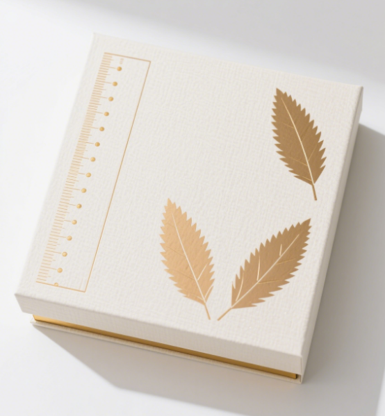
We use debossing to add quiet luxury, real touch, shelf power. It lifts unboxing and brand recall.
Perfume boxes, skincare sets, premium kits. It signals quality, no loud graphics. Pair to Huasheng cold stamping foil for shine on large runs.
Subtle logos, fine patterns
Clean panels, soft shadows
Works on textured boards
Artisanal chocolate, premium spirits, gift tins. It boosts the unboxing moment; hands feel the mark first. Seal accents using Huasheng hot stamping foil.
Badges, crests, neck labels
Deep fields on rigid sleeves
Strong presence in bar light
Book covers, journals, premium cards. Textured stocks love it; edges show crisp light play. Short runs pair nicely to Huasheng toner reactive foil.
Titles, chapter devices
Patterned endpapers
Leatherette wraps
Retail labels, folding cartons, rigid gift boxes. It adds tactile stops on crowded shelves; eyes follow shadows. Spot accents via Huasheng digital foil when color pops help.
Quick chooser
| Category | Common items | Why use debossing | Optional partner finish |
|---|---|---|---|
| Luxury and cosmetics | Perfume boxes, skincare lids | Premium cue, quiet branding | Huasheng cold stamping foil |
| Food and beverage | Spirit cartons, chocolate sleeves | Unboxing lift, hand feel | Huasheng hot stamping foil |
| Publishing and stationery | Journals, book covers | Texture contrast, long wear | Huasheng toner reactive foil |
| Labels and gift boxes | Shelf labels, rigid boxes | Tactile impact, subtle shadows | Huasheng digital foil |
Debossing speaks in touch and light. It looks premium, feels real, sticks in memory during unboxing.
Sophisticated look; soft shadows change as you move it.
Durable mark; no fade, no peel.
Hands remember the press; brand recall rises.
Often a single die; embossing needs two. Setup stays lean.
Broad material reach; paper, leather, fabrics, plastics.
Easy pairing plus foil or spot UV for highlight zones.
Strong value vs many premium finishes.
For safety packs or labels, teams add Huasheng reflective tape near debossed panels for night visibility.
| Aspect | Debossing | Notes |
|---|---|---|
| Tooling | One die in most jobs | Faster prep; fewer plates. |
| Run cost | Often lower vs many luxe finishes | Value scales on longer runs. |
| Combinations | Deboss plus foil or spot UV | Eye-catch plus texture in one set. |
| Footprint | Relatively eco-friendly | Fewer layers vs some methods. |
We can also add shine on select lines using Huasheng toner reactive foil for short runs, or cold stamping foilon inline work—depth plus sparkle, one story.
Issues happen. We spot them fast, then dial in clean, repeatable runs.
Troubleshooting map
| Problem | Signs | Likely cause | Fix |
|---|---|---|---|
| Registration issues | Image sits left or high | Loose guides, poor marks, complex art | Lock paper guides, add alignment marks, use digital register. |
| Depth inconsistency | Some zones shallow, others deep | Uneven pressure, mixed stock | Calibrate press, run pressure tests, use uniform material thickness. |
| Material damage | Cracks, crush, shine marks | Excess pressure, risky die geometry | Do pre-production tests on real stock, adjust die design, reduce load. |
| Design clarity loss | Blurred micro shapes, filled counters | Tiny strokes, tight spacing, raster art | Simplify artwork, keep spacing, convert to vector. |
Fast checks before a run
Square the feed. Fixed side guides keep sheets steady; marks show drift early. Digital register tightens complex layouts.
Prove pressure. Short strips, even grid, same stock; record the sweet spot.
Protect the substrate. Trial pulls on actual boards; tweak die bevel or depth before volume.
Clean the art. Use vectors, ~2 mm strokes, ≥ 1 mm gaps; keep away from folds and edges.
When issues persist
Swap mixed lots for one uniform batch; it stabilizes depth.
Tame aggressive dies; soften edges, reduce point loads on thin stocks.
For logo work, pick which elements get the press; leave fine hairlines in print. It reads cleaner, fewer blowouts.
Logos need choices. We pick parts to press, parts to leave flat, parts to add foil. Clean lines, clear space, real tests.
Press bold shapes, icons, initials. Small text stays flat or prints.
Want shine on a crest or monogram? Add Huasheng digital foil on a second pass.
Minimal marks love blind deboss; luxe vibe, no extra color.
Too shallow, it fades. Too deep, it risks the board or leather.
Always test on the real stock before volume runs.
Logo spec quick sheet
| Rule | Number | Why |
|---|---|---|
| Minimum stroke | ~2 mm | Edges hold detail; no crush. |
| Element spacing | ≥ 1 mm | No blur between shapes. |
| From folds/scores | ≥ 0.125 in | Creases stay sharp. |
| From edges/spines | ≥ 2 mm | Safer register near trims. |
| Artwork detail | Avoid micro detail | Tiny counters fill in. |
| Logo element | Press | Leave flat | Add foil |
|---|---|---|---|
| Icon or mark | Yes | Rarely | Optional accent |
| Wordmark bold | Yes | Sometimes | Title line accent |
| Tagline small | Rarely | Yes | No |
| Seal or crest | Yes | Sometimes | Great pick for metallic pop |
Lock guides and marks; tighten digital register on complex art.
Calibrate pressure; keep stock from mixed lots for even depth.
Review die geometry; soften sharp tips on thin boards to prevent scuff or crush.
Design moves fast. We see four clear shifts you can use today.
Quiet marks. Strategic placement. Blind deboss on clean panels. Premium cues, no noise. Pair accents using Huasheng hot stamping foil only where shine helps.
Eco stocks rise. Recycled boards, fiber-rich papers, lean finishes. Debossing adds premium feel minus heavy layers. We often combine it and Huasheng packaging film for protection, low visual load.
Eyes see shadows. Hands feel depth. Unboxing turns into a moment. Debossing anchors the touch cue; other finishes play support roles.
QR zones inside a deboss field. Smooth read, tidy scan window. Extra content lives online; pack stays refined. We keep codes simple; strong contrast around the pocket.
Quick planner
| Trend | What to do | Try this |
|---|---|---|
| Minimalist | One mark per panel; blind deboss | Small logo, deep press |
| Sustainable | Fewer layers; sturdy eco board | Add Huasheng packaging film for scuff guard |
| Multi-sensory | Larger fields for finger travel | Soft-touch zone plus deboss |
| Digital | Debossed frame for QR | Matte print field, crisp edges |
Creative prompts
Swap ink blocks for texture; let depth carry the brand voice.
Use eco stocks; dial pressure to protect fibers.
Map the hand path across lids and sleeves; place the press where fingers land first.
Frame a QR in a shallow pocket; keep a clean margin for fast scans.
Before you deboss, check the substrate weight and texture; add backing for fabrics. Verify artwork: strokes about 2 mm, gaps at least 1 mm; keep clear of folds and edges. Choose the right type: blind, registered, foil plus deboss, or multi-level. Define press method and heat, then run test pulls on the actual stock. Set registration aids, calibrate pressure and dwell for even depth, and record final settings for repeatable runs.
A: An indented impression made using a die, pressure, optional heat.
A: No. Embossing raises; debossing sinks.
A: Not always. Heated or preheated dies help certain substrates.
A: Paper ≥300 gsm, textured stocks; leather; dense fabrics; plastics; rubber; metals; composites.
A: Deeper feels bolder; too deep risks crush. Test on actual stock.
A: Yes. Foil plus debossing adds metallic shine and tactile depth.
A: Pros: premium feel, single die, broad compatibility. Cons: registration, depth drift, substrate damage; fix by calibration, clear art.
A: Luxury, cosmetics; food and beverage; publishing, stationery; labels, cartons, gift boxes.
A: Strokes ~2 mm; gaps ≥1 mm; 0.125 in from folds; 2 mm from edges.


