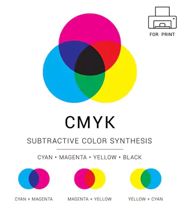
Why do printed colors look dull next to your screen?CMYK is a subtractive, print-first model using ink instead of light.It blends Cyan, Magenta, Yellow, and Key/Black—cmyk cyan magenta—for accurate color and contrast.In this post, you’ll learn what is the CMYK color model and its components.
CMYK Explained in 60 Seconds
Here is the fast answer to what is the CMYK color model and its components. It powers print.
CMYK is subtractive. Inks absorb light. Paper reflects remaining light.
C M Y build color strength. K adds depth, contrast, ink economy.
Used in offset, digital, flexo, gravure, screen. It drives packaging and labels.
RGB holds a wider gamut. Converting to CMYK can shift hues. Use ICC profiles and soft proof.
| Component | Core job | Quick tip |
| Cyan | Cools skies and greens | Balance against magenta |
| Magenta | Shapes reds and violets | Watch skin tones |
| Yellow | Adds warmth and light | Paper tone changes it |
| Black | Sharp detail and density | K only for small text |
Hot stamping foil on premium cartons. Keep the CMYK base clean for sharp foil edges.
Cold stamping foil on flexo labels. Control total ink coverage for flat, even areas.
Toner reactive digital foil on short runs. Check RGB to CMYK early to avoid surprises.
What Does CMYK Stand For? Understanding Each Component
Here is what is the CMYK color model and its components. We keep it practical.
| Component | Primary role | Common issue | Quick tip |
| Cyan | Skies, aquas, neutrals | Weak C → warm cast | Add C, test proofs |
| Magenta | Reds, purples, skin | Too much → purple blues | Reduce M in blues |
| Yellow | Greens, skin warmth | Paper tone, dot gain | Check stock early |
| Black | Depth, detail, cost | Muddy big areas | Use rich black wisely |
Cyan in the CMYK Color Model
It cools skies and sea tones.
Weak cyan warms grays. Faces shift orange.
On PET holographic film, we add white underprint. It stabilizes hue.
BOPP matte prints need tighter curves. They show casts fast.
Magenta in the CMYK Color Model
It steers reds and violets.
Too much magenta pushes blues purple.
Thermal film lamination keeps skin smooth. It also hides minor noise.
We watch M on brand reds for labels.
Yellow in the CMYK Color Model
It builds greens and friendly skin.
Paper tone changes yellow fast. Dot gain boosts it on uncoated stocks.
Reflective tape needs bold Y areas. We proof under bright light.
Packaging film runs favor controlled Y curves.
Key Black in the CMYK Color Model
K means key plate. It locks detail and neutrals.
It adds density, saves ink, improves contrast.
Pure black: small text. Crisp edges.
Rich black: large fills. Deep tone.
-
Registration black: marks only. Never design.

How the CMYK Color Model Works (Subtractive vs Additive)
Subtractive Color Theory in CMYK
Inks absorb wavelengths. Paper reflects the rest. We see that reflection.
C + M + Y aim for black. Real pigments miss. Result: muddy dark.
K enters. It restores depth, clean edges, stable grays.
Mini flow
Light hits ink layers
Layers absorb bands
Remaining light returns to our eyes
CMYK vs RGB: Additive Light vs Subtractive Ink
| Aspect | CMYK (Subtractive) | RGB (Additive) |
| Energy | Reflected light | Emitted light |
| Device | Press, printer | Monitor, phone |
| Gamut | Narrower | Wider |
| Look | Softer solids | Punchy neons |
Bright RGB cyans, greens, violets may clip in CMYK.
We soft proof. We manage profiles. Fewer surprises.
Why CMYK Needs Black Ink
Pigments stay imperfect. Neutrals drift. K holds balance.
It sharpens small type, hairlines.
It reduces total ink coverage. Press sets a TAC limit.
Recipe hints
From File to Press: The CMYK Printing Pipeline
Halftone Dots, Screen Angles and Moiré
In CMYK, tiny dots carry tone. Dot size shifts lights, mids, darks. Mis-angled screens create moiré, a wavy interference look. We set angles carefully, so images stay smooth.
| Color | Typical angle deg | Note |
| C | 15 | Cool layer |
| M | 75 | Skin control |
| Y | 0 or 90 | Least visible pattern |
| K | 45 | Key detail plate |
LPI, DPI, and PPI — What Matters for CMYK Output
LPI describes the press screen. PPI describes image detail. DPI describes device spots. They must align. 85 LPI matches 170 PPI images. 133 LPI matches 266 PPI. 150 LPI matches 300 PPI. 175 LPI matches 350 PPI. We place images at final size, so sharpness holds.
Under Color Removal UCR and Gray Component Replacement GCR
Neutral zones often carry shared C M Y. UCR pulls some of it, then K fills. GCR replaces the gray share across colors. Neutrals stabilize. Drying improves. Ink use drops.
Total Area or Ink Coverage TAC
Presses set a TAC cap. Go past it, drying slows, smudges appear. Coated stocks often run near 300 percent. Uncoated sits closer to 260. Newsprint stays lower.
| Stock | Typical TAC percent |
| Coated | 300 |
| Uncoated | 260 |
| Newsprint | 240 |
Overprint vs Knockout and Trapping
Small black type can overprint safely. Colored elements usually knock out, so mixes do not shift. Trapping adds a tiny spread or choke between colors. It hides slight mis-register on press. Values often sit near 0.05 to 0.20 mm. We verify on proofs, so what is the CMYK color model and its components stays clear in print.
Color Management: Converting to the CMYK Color Model Correctly
Why Colors Shift When Converting RGB to CMYK
RGB shows a wider gamut. CMYK covers less. Big greens, neons, violets can clip.
Rendering intents guide mapping:
| Intent | Main effect | Best use |
| Relative | Exact matches, hard clipping | Solid brands |
| Perceptual | Smooth compression | Photography |
ICC Profiles for CMYK Printing
CMYK stays device dependent. Press, paper, ink set shape results.
Ask the printer for its ICC profile and TAC limit.
| Standard | Region focus | Typical use |
| GRACoL | North America | Sheetfed, coated |
| SWOP | North America | Web offset, publications |
| FOGRA | Europe | Coated, uncoated families |
Soft Proofing and Hard Proofing
Calibrate the monitor. Control ambient light.
Enable soft proof using the printer ICC. Toggle on and off. Judge shifts early.
Order a contract proof. Check gray balance, solids, overprint, registration. Agree on tolerances.
How to Convert to CMYK in Adobe Apps
For readers asking what is the CMYK color model and its components, these steps keep work predictable.
Photoshop
Save a copy first.
View > Proof Setup > Custom; choose target CMYK profile; preview.
Edit > Convert to Profile; pick intent; enable black point compensation.
Inspect blacks, neutrals, skin. Export as TIFF or PDF X-1a or X-4.
Illustrator
File > Document Color Mode > CMYK.
Edit > Assign Profile; select the printer ICC.
Use process swatches for CMYK; call spot for Pantone when needed.
Overprint Preview on. File > Save as PDF; choose a PDF X preset.
InDesign
Place links at final size. Avoid last-minute mode swaps.
Preflight panel: flag RGB images, low PPI.
Export > Adobe PDF; choose PDF X; set output intent; review Ink Manager for spots.
Building Blacks and Neutrals in the CMYK Color Model
Pure Black K only vs Rich Black CMYK mix
Body text needs K only. Edges stay crisp. Registration stays tight.
Large fills need depth. Rich black adds CMY under K. It looks deeper.
| Use case | Recommended black | Why it works |
| Small text | K only 80 to 100 | Sharp edges, clean traps |
| Hairlines | K only | No color fringing |
| Big background | Rich black CMY plus K | Darker tone, fuller shadow |
| Varnish under foil | K only for type | Reliable holdout, tidy edges |
Example recipes
Registration Black 100 100 100 100 What It Is and Why Not to Use It
It targets marks and bars only. Press crews align plates.
Design use causes heavy ink. Drying slows. Edges spread. Avoid it in live art.
Neutral Gray in CMYK
We choose between two paths.
K gray uses only black. It resists casts. Great for small type and rules.
Four color gray mixes CMY plus K. It can look smoother in big areas.
Light changes can shift hue. That is metamerism. We proof under the right light.
To prevent casts, we use GCR. We let K carry shared gray. We keep balance steady.
CMYK Color Model vs Spot Colors Pantone and Special Inks
When to Use Pantone Instead of CMYK
Brand colors need tight matches. CMYK drifts on some hues.
Small runs use digital. Big runs use offset. Cost shifts by plates and washups.
We pick Pantone for strong solids, vivid oranges, deep blues.
PET metallized film loves bold spot inks. It keeps edges clean.
| Scenario | Pick | Reason |
| Exact brand red | Pantone | Stable hue |
| Short label job | CMYK or one spot | Faster setup |
| Corporate blue | Pantone | Fewer shifts |
| Wide photo spread | CMYK | Smooth blends |
Metallics, Fluorescents, White Ink, and Varnishes
CMYK uses dyes and pigments. Light scatters. No metal sparkle.
Metallic inks reflect. They need aluminum flakes.
Fluorescents pop under UV. CMYK cannot mimic that glow.
White ink blocks dark stocks. It builds an underlay.
Varnish changes sheen. Gloss boosts depth. Matte softens noise.
Glitter film adds specular flash. We plan layers early.
Expanded Gamut CMYKOGV
OGV adds orange, green, violet. It stretches the CMYK map.
Many brand spots convert cleanly. Some still miss metal shine.
We load the press profile. We tune curves, TAC, traps.
It helps what is the CMYK color model and its components feel complete for wide images.
Preparing Artwork for CMYK Printing Practical Checklist
We built this as a hands-on guide for readers asking what is the CMYK color model and its components. It moves from setup to export, so files hit press cleanly.
Document Setup
Start in CMYK mode. Pick the printer’s ICC profile before color work. Set units, page size, margins. Name layers clearly. Keep dielines and varnish on their own spot swatches. If the job includes foil, add a separate spot plate labeled FOIL and confirm rules with the converter.
Do this early
CMYK document intent
Assign target ICC (GRACoL, FOGRA, SWOP as specified)
Master page for grids, margins, baseline
| Stock | Common ICC starting point | Note |
| Coated sheetfed | GRACoL | High TAC, crisp detail |
| Web offset | SWOP | Publication workflows |
| EU coated/uncoated | FOGRA | Regional standard sets |
Images and Graphics
Place images at 300 PPI at final size. Avoid upscaling. Convert photographs using the target CMYK profile, not sRGB defaults. Keep logos and icons as vector for sharp edges. Link files, don’t embed huge rasters. Maintain embedded profiles on placed images, then unify at export.
Practical pairings
150 LPI screens pair well with 300 PPI images
175 LPI prefers 350 PPI sources
Save TIFF or PSD for print; avoid repeated JPEG cycles
Type and Line Art
Body text prints best as K-only. It stays sharp and stable. Minimum sizes rise on uncoated stocks. Reverse type needs weight. Ultra-thin hairlines break on press.
Easy rules
Body text: K-only, 8–9 pt coated, 9–10 pt uncoated
Hairlines: ≥ 0.25 pt; avoid four-color rules
Small knockouts: add tracking and weight for safety
Bleed, Safe Area, and Trim
Add bleed before layout—3 mm or 0.125 inch is common. Keep live content inside a safe area by 3–5 mm. Put dielines on a non-printing spot color. For foil areas or spot varnish, use separate spot plates. Ask if they should overprint or knock out based on finishing.
Quick map
Bleed: extends color past trim
Safe area: keeps text clear of trims and nicks
Trim: final size after cutting
Overprint and Knockout Settings
Turn on Overprint Preview while designing. Small black text can overprint safely. Colored fills usually knock out to avoid dirty mixes. Check trapping policies before handoff. Barcodes and small QR codes should remain 100% K for best scan reliability.
At a glance
Overprint: small K text, registration marks, some spot plates
Knockout: tinted objects, light colors, most photos and gradients
Preflight and PDF X Export
Run a preflight pass. Flag RGB images, low PPI, missing links, overset text. Verify total ink coverage (TAC) stays under the press limit—often ~300% coated, ~260% uncoated. Inspect separations for accidental four-color blacks or hidden spots.
| PDF flavor | When to choose | Key behavior |
| PDF X 1a | Legacy, simple transparency | Flattens transparency, fixed output intent |
| PDF X 4 | Modern, live transparency | Keeps ICC profiles, honors overprint |
Workflow example
Soft proof using the printer ICC.
Fix blacks: K-only for small text, rich black for large solids under TAC.
Validate bleeds, safe area, dielines, foil plates.
Export PDF X-4, set Output Intent to the printer profile.
Open the PDF, toggle separations, check overprint behavior again.
Final checks
Fonts embedded; outline only when the shop requests
Images CMYK or approved spots; no unintended RGB
Barcodes at 100% K; resolution verified
Foil and varnish plates named, spot colors defined, instructions included
The CMYK Color Model Across Substrates and Processes
Coated vs Uncoated Papers
Coated stocks show wider gamut. Dots stay tight. Dry-back stays mild.
Uncoated papers absorb more. Dots grow fast. Colors mute after drying.
We tune builds so neutrals hold steady. We trim TAC per stock.
| Factor | Coated paper | Uncoated paper |
| Gamut | Wider, higher saturation | Narrower, softer |
| Dot gain | Lower | Higher |
| Dry-back | Light shift | Stronger shift |
| Typical TAC | Around 300 percent | Around 260 percent |
Tip for what is the CMYK color model and its components. Use K only for small text. Add weight for reverse type on uncoated.
Films, Plastics, and Non Porous Surfaces
Plastics change everything. Ink needs grip. Primers help. UV inks cure fast.
We run adhesion tests. Cross hatch. Tape pull. It proves stability.
Color can look different on glossy film. PET metallized film boosts punch.
BOPP thermal film prefers clean separations. It rewards neat trapping.
| Surface | Prep need | Ink choice | Color feel |
| PET clear | Corona or primer | UV or solvent | High gloss, sharp edges |
| PET metallized | White underlay first | UV | Intense, mirror like |
| BOPP matte | Primer often | UV or water based | Softer, lower flare |
Digital vs Offset vs Flexo
Same CMYK values, different devices, different looks. Engines carry unique gamuts. Screening methods vary. Ink laydown shifts tone.
Digital toner presses use fine FM like screens or proprietary dots. Blacks print crisp. Large solids may show texture.
Offset runs AM screens. Plates hold tiny dots. Gain depends on stock and water balance.
Flexo uses plates and anilox rolls. Dots grow more on film and paper. Trapping rules matter.
| Process | Typical screen | Strength | Watch out |
| Digital | Stochastic or hybrid | Fast setup, short runs | Large solids, gloss banding |
| Offset | AM 133 to 200 LPI | Smooth blends, fine type | Water ink balance, scum risk |
| Flexo | AM or hybrid | Film labels, long runs | Dot gain, anilox limits |
For labels on cold stamping foil, we dial traps and keep TAC safe. For cartons on holographic film, we add white underlay so hues stay true.

Testing and Quality Control for CMYK
Soft Proofing Workflow
Calibrate first. Target D50 white point, gamma 2.2, 100–120 cd/m².
Control ambient light. Neutral walls. No glare.
Load the press ICC. Enable paper color and black ink simulation.
Toggle soft proof on, off. Spot shifts early.
| Step | Tool | Goal |
| Calibrate display | Hardware puck | Stable white, tone |
| Load ICC | OS or app | Match press aim |
| View booth | D50 light | Judge proofs fairly |
Hard or Contract Proofs and Press Checks
Request a contract proof. Same ICC. Stock close to live run.
Inspect gray balance. Look for green or magenta casts.
Check solids for even lay. No banding.
Verify overprint on small black type.
Confirm registration. Tight hairlines, clean serifs.
Scan images for mottling, dirty shadows.
| Inspect | What to see | Quick fix |
| Grays | Neutral ramp | Adjust GCR, curves |
| Solids | Smooth tone | Raise ink, change stock |
| Overprint | Black reads clean | Toggle settings |
| Registration | No color fringes | Add trap, adjust feed |
| Mottle | Even texture | Ink density, speed |
Communicating With Your Printer
Share a tight handoff. It reduces guesswork for what is the CMYK color model and its components in practice.
Target ICC name, version
TAC limit for stock
PDF X flavor X 1a or X 4
Stock grade, finish, weight
Ink set, any spot or Pantone
Finishing notes: hot stamping foil, cold foil, varnish, laminate
Screens or LPI, trapping policy, overprint rules
Delivery date, run length, color bars, pull-sheet plan
| Handoff item | Example |
| Output intent | GRACoL 2013 or FOGRA51 |
| TAC limit | 300 percent coated, 260 percent uncoated |
| PDF | PDF X 4 |
| Finishing | Foil plate as spot color |
| QA marks | Targets, bars, registration marks |
Q: What is the CMYK color model and its components, in one paragraph?
A: CMYK is a subtractive, print-first color model using Cyan, Magenta, Yellow, and Key Black. Inks absorb light; paper reflects what we see. C, M, Y build hue and saturation; K adds density, fine detail, and stable neutrals. It powers packaging, labels, and most press workflows.
Q: Is CMYK better than RGB for printing?
A: Yes. Presses lay down ink, not light. RGB holds a wider, screen-only gamut. Convert using the printer’s ICC profile, then soft proof. Use spot colors for hues CMYK cannot cleanly hit.
Q: Can I convert RGB to CMYK without losing color?
A: Some loss is inevitable. Use the correct ICC, then try perceptual intent for photos or relative colorimetric for logos. Adjust saturation selectively, proof on paper, consider spot or expanded-gamut if needed.
Q: What CMYK values make true black and rich black?
A: True black for small text: K-only, typically K=100 or 95–100. Rich black for large areas: CMY under K, for example C60 M40 Y40 K100 on coated, or C40 M30 Y30 K95 on uncoated. Always stay under the press TAC limit.
Q: Why do my printed colors look dull vs my monitor?
A: Monitors emit RGB light; print reflects CMYK ink. The print gamut is smaller. Calibrate your display, load the press ICC, soft proof, then adjust. Choose brighter stocks, control ink limits, and consider spot colors for punch.
Q: What’s the best CMYK profile for coated vs uncoated paper?
A: Use what your printer specifies. Common choices: GRACoL (coated, NA), SWOP (web offset), FOGRA39/51 (EU coated), FOGRA52 (EU uncoated). Different papers need different TAC and tone curves.
Q: How do I avoid moiré in CMYK halftones?
A: Use standard screen angles (C≈15°, M≈75°, Y≈0°/90°, K≈45°). Match image resolution to the line screen (e.g., 150 LPI → 300 PPI). Avoid scaling patterned images; consider stochastic screening when available.
Q: What is total ink coverage and why does it matter?
A: TAC is the sum of C+M+Y+K at a pixel. Exceeding it slows drying, causes setoff, muddy shadows. Typical limits: ~300% coated, ~260% uncoated, lower for newsprint. Tune GCR/UCR to reduce TAC.
Q: When should I use Pantone spot colors instead of CMYK?
A: When brand accuracy is critical, when you need metallic or fluorescent effects, or when a specific solid color falls outside CMYK. Spots help short runs of flat tints and demanding logos.
Q: What CMYK mix gives a clean gray without a color cast?
A: For small text and rules, use K-only (e.g., K=50 for mid gray). For large panels, use GCR-heavy mixes so K carries the gray, or a balanced CMY+K recipe verified by soft/hard proofs under D50 lighting.
Q: How do I prepare a PDF/X for CMYK printing?
A: Preflight first: fix RGB, low PPI, missing links, four-color blacks. Add bleeds, set Output Intent to the printer ICC. Export PDF/X-1a for flattened, simple workflows or PDF/X-4 for modern, profile-driven jobs. Verify separations and TAC.
Knowing the CMYK color model and its components—Cyan, Magenta, Yellow, Key/Black—makes print results predictable. You can choose proper blacks, manage TAC, and plan profiles before you export. Always soft proof on a calibrated display. Order hard proofs for critical jobs. Share ICC profiles, stock, and finishing notes with your printer. Align expectations early, then press runs stay sharp, neutral, and consistent.


